Course Content
Welcome
Congratulations on being invited to an ERC grant interview. Advancing to the second step of the evaluation procedure is an achievement in itself. It proves you have an excellent proposal and impressive resume. Yet, there is still a hurdle to overcome: the interview. This course will support you through the sometimes stressful period that lays ahead.
0/3
Module 1: Strategy
In your research proposal you have tried to fit years of research into a few pages. You managed. The document convinced the panel and external reviewers to invite you to evaluation step 2. In this final phase you have an online interview consisting of a presentation and Q+A at your disposal. Depending on the panel you may present your proposal in only ten, eight, five, or even three minutes and you have time to answer around ten questions. That is it. How do you turn this given opportunity into a success? In this module you create a solid strategy in four steps. In step 1 we first explore the low hanging fruit: what does the panel expect from you? Then we have a look at the panel and show how you can use this knowledge to improve your chances of reaching your goal. Step 2 is all about adapting to the online environment. Then we discuss the core message in step 3. Finally, in step 4, you brainstorm about your unique selling points.
0/1
Step 1: Audience and Goal
Convincing the panel members to fund your proposal. That is what counts in the interaction you are now preparing for. We first mention the low hanging fruit of checking the boxes and then move on to audience and goal.
0/7
Step 3: Core message
Audience, goal, and setting: check! Now let us have a look at the actual content of the proposal. We will start with its shortest version: the core message.
0/4
Step 4: Unique Selling Points
So you have formulated your Big Idea into a sticky core-message. But, why would they buy it? The presentation and the Q+A offer plenty of opportunities to mention (and demonstrate) the reasons for awarding you. Before thinking about integrating them in a storyline, it pays to list your, what marketeers call, unique selling points. These USPs make you and your proposal stand out amongst your competitors. A good way of creating this list of USPs is by brainstorming using five questions. They are: Why this? Why now? Why like this? Why you? Why here? These questions aim at the importance, urgency, approach and methodology, CV, and network respectively. Let’s dive deeper into each of them.
0/5
Module 2: The presentation
So far you have explored the panel, defined your big idea, listed and prioritized the arguments that will make them buy it, and you learned how to optimally use the online environment. The second module focusses on the first section of the interview: the presentation. In four steps we here help you to translate your strategy into a coherent story and slides. We follow a route that fosters creativity and out-of-the-box thinking in step 5 and 6. They respectively deal with composing a compelling storyline that integrates your best unique selling points and sketching the slides that help you to bring it across. You thus design a storyboard. In step 7 and 8 your translate this sketch in a script (the words you will say) and a slide deck. Here we focus on the practical aspects of text writing and slide design.
0/1
Step 5: Storyline
You have formulated your Big Idea. And, you know why the panel would buy it. Convincing is not a matter of just sharing the facts. It is a matter of creating a story that makes the panel members believe. What makes a story a story? Let us dive deeper into it.
0/5
Step 6: Sketching slides
Thus far you have been approaching your presentation from a textual perspective. Now we welcome a true rhetoric superpower aboard: images.
0/5
Step 7: Script
In the previous step you have completed your storyboard by adding sketches. Now we go back to text again. Text and images provide different angles on the same story. Iterating between them allows you to both finetune your texts and images.
0/4
Step 8: Designing slides
You have finished your storyboard and your script. Now it is time to open your PowerPoint and actually make slides. Here are some guidelines that help you to translate your story-board into slides that do not confuse, but do create impact.
0/5
Module 3: Delivery
You strategized in module 1 and compiled your presentation in module 2. Module 3 is about bringing it home. Strategy and presentation are central aspects of the preparation. But, they are useless if you cannot access what you have prepared in the heat of the moment. Due to the nervousness you experience during the interview, your working memory diminishes. It makes thinking clear and accessing your short term (the things you have prepared) and your long term memory. Therefore, we put the working memory at the centre of this module. In step 9 we explain what the working memory does and why it fails you when you experience a high level of stress. Also, we teach you how to regain it and keep it up and running by breathing, grounding, and functional movement. Step 10 builds on that and explains a way to train little behavioural changes that promote connection with you and the content you present. Then, in step 11 we teach you how to stay in control during the Q+A by defining and structuring what we call answer drawers and how to access them in the heat of the moment. Finally, step 12 provides ideas for how to organize mock-interviews in such a way that they help you make the finishing touch.
0/1
Step 9: Dealing with stress
In module 1, you have been working on your strategy. Module 2 was all about the presentation. Both are essential parts of your preparation. However, a perfect preparation can only be completed by a convincing performance. The most important selling point is a demonstration of genuine enthusiasm during the interview. But, how can you be enthusiastic and authentic during a stressful event such as a grant interview? Stress diminishes your working memory and therefore the accessibility of your memory, the place where all your knowledge is stored. Let us have a look at how this works and what you can do about it.
0/5
Step 10: Presenting
What do you like the most: presenting or Q+A? Most people have a preference for one or the other. Some like the presentation better. While presenting you are in control. One can rehearse the script till they fully master it. Others prefer the Q+A part. While in conversation they feel connected with your audience.
0/5
Step 11: Answering questions
Of course the presentation is an important starting point. The Q+A is where you really bring it home. After a mediocre presentation you still can convince the panel with a strong Q+A. A perfect pitch will be ruined if it is followed by a weak Q+A. But, because of the difficulty to predict what the questions will be, many applicants put a lot of effort in finetuning the presentation and almost neglect to prepare for the Q+A. Here we give you the tools to master the Q+A in advance.
0/4
Step 12: The last stretch
We are almost there. You have worked your way through the presentation and you know how to present it. But, the proof of the pudding is in eating it. Organizing a few mock-interviews can complete your preparation. These simulations provide the outsider’s feedback on your presentation and answers. With this feedback you can finetune your story, slides, and answers. But even more important is the pre-exposure mock-interviews provide. During the confrontation with the mock-panel member, you will experience the same type of stress responses that the actual interview will evoke. This pre-exposure helps to better cope with the real interview itself.
0/4
ERC StG interview
Light, camera, and composition

Artificial light

Daylight

Daylight

1. Light

The difference between daylight (natural light) and lamplight (artificial light) is immense. Daylight is bluer. It gives you a natural complexion and a calm appearance. Lamplight, on the other hand, is often more yellow and makes you look less healthy. It can also cause weird shadows if the lamp is not positioned properly. A fluorescent beam above your head creates drop shadows under your eyebrows and eyes.

To get lamplight right, professional film makers use three-point lighting: key light, fill light and back light. It is quite complicated to properly install artificial lighting, so our recommendation would be: use daylight.


 Tip 1: avoid ‘mixed light’. Turn off the lights in your study or office and see what that does to the image. If you only use daylight, your camera will know what the white balance should be, and you will get a beautiful complexion.


Tip 2: if a shadow still falls on your face while you are using daylight, make the shadow disappear with a LED lamp with white light. This is called a fill light. Be careful with glasses, you don’t want to see a reflection from the lamp.
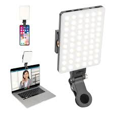
 

LED lamp

Fill light


2. Camera

Most built-in cameras on PCs and laptops have an automatic white balance. This means that they correct the color of the light to an average. The downside is that they do that continuously. So, if you move your head, more or less light may fall on the camera and it will adjust that. The effect is that you get an image that goes from bluish to yellowish, for example. That’s distracting.


A webcam often comes with software that allows you to set settings such as white balance or exposure. Then the camera no longer corrects this automatically. A reliable webcam is the Logitech Brio Ultra HD. It comes with this software.
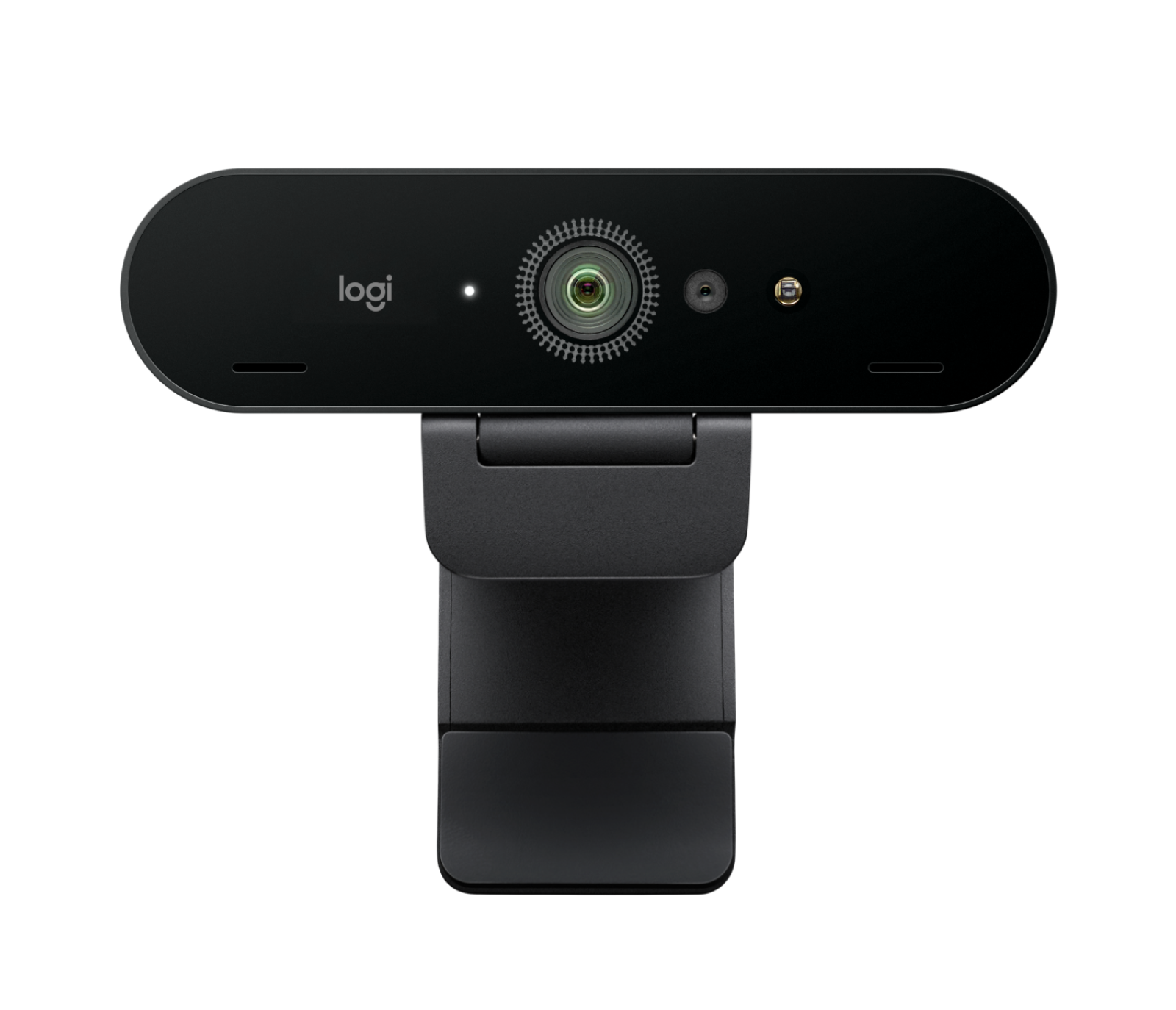
Logitech Brio

Our favorite: Logitech Brio


3. Composition

The best composition is creted by positioning your webcam at eye level and placing your eyes on the top line of the Rule of Thirds in the image.


Eye level

Professional film makers play with eye level to express dominance or submissiveness. You can make someone look taller or smaller by not filming at eye level but slightly above or below. Even if it’s a little bit, you subconsciously get a subtle message. So, to appear neutral and trustworthy, place your camera at eye level, or your eyes at camera height.


How do you do this? Raise or lower your office chair, or place your laptop on a stand. You might as well stand up and use a standing table. Regardless of your solution, try to create a stable solution, so that the image is not shaking if you touch your laptop. 


Rule of Thirds

If you were to place a tic tac toe grid over your image, your eyes should be on the top line. This rule of thirds, or golden ration, gives paintings a balanced composition and can be found in a wide range of natural phenomena (from flowers to hurricanes). If you recognize it, you see the rule of thirds on television all the time. It doesn’t matter if you’re close or far from the camera, if you place your eyes on the imaginary top line, it will just look good.

Rule of thirds


Eye contact

In the in-person setting eye contact is a natural way of connecting. During an online interview this is not necessarily the case. Programs such as Zoom, Teams and Webex have built-in software to correct eye position. When you look into the camera, you often look too high. What does work is to drag the window containing the panel, right under the camera. Note: this trick might not work when some panel members join the meeting remotely.


Try this out in a test meeting with someone on Webex. Look at different points on your screen and ask: Am I looking at you now? You can put a sticker on that spot, so you know where to look during your presentation.


Tip 1: If you have placed the webcam at eye level, adjust the lid of your laptop or PC screen so that your eyes are on the top line.

Tip 2: Make sure you can be seen from halfway down your chest to the top of your head. This is called a medium shot.

Tip 3: If you work with written notes, place them close to the camera. Look at the notes occasionally and then make eye contact with your audience again. The viewer is not interested in the top of your head.

Tip 4: presenting while standing is more energetic, both for yourself and for the people who listen to you.